
Skip to content
Jorge Molina
Back to home
Start a conversation
Back to home

Index

  • Overview
  • Product Thinking
  • Idea to Product
  • Tech Stack & Pipeline
  • Design System
  • How It Works
  • Product Decisions
  • Beta & Learnings

Shall we build the next moonshot together?

Open to product design roles and collaborations in AI-first teams.

Privacy policy
Start a conversation
Visit LinkedIn (opens in new tab)

Personal Project · May 2026

PickPal

Your phone reminds you the day of, too late to give anything good. I designed PickPal and directed its full-stack build with Claude Code: idea to private beta in 7 days.

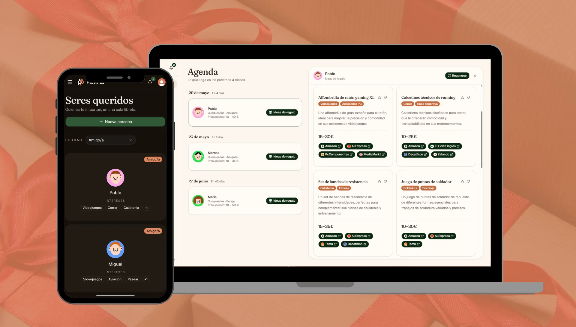
PickPal running on a phone and a laptop over gift-wrap paper: the loved-ones list in dark mode and the agenda with AI gift ideasTry PickPal

Role

Product Designer · directed the full-stack build with Claude Code

Tools

Figma · Claude Code · Next.js · Convex · Clerk · Gemini 2.5 Flash · Resend

From idea to production

7 days

Private beta users

10+

Executive Overview

PickPal helps you land on a thoughtful gift for the people who matter, every time. It centralizes who they are (interests, notes, sizes, important dates) and, when an occasion nears, generates AI ideas matched to that specific person and moment. I designed all of it, then directed the full build with Claude Code: design system, copy, and full stack, shipped to a private beta of real users.

The Problem

Two chained problems: forgetting the date (you're reminded the day of, too late for anything thoughtful) and, even in time, not knowing what to give. Faced with a blank, you default to the generic last-minute pick.

The Solution

A web app pairing a date tracker with an AI gift advisor: add the person, the occasion, and the budget, and get 9 personalized ideas with direct links to buy.

Product Thinking

Where the idea came from

PickPal started as my own problem, and informal conversations with friends and family kept surfacing the same pattern. Before writing any code I mapped how people patch this today (phone reminders, wishlists, a last-minute search), and none closed the loop from knowing the date to knowing the gift. Lightweight validation, not formal research, but consistent enough to build on.

Existing Alternatives & Their Gaps

Of the four common workarounds, only PickPal covers the full chain: from anticipating the date to a concrete idea that fits the person and the budget. This is my own scoring of my own product, so read my column as intent rather than an audit.

CapabilityPickPalPhone remindersAmazon WishlistsGoogle searchReminder apps
Reminds in advance
Suggests gift ideas
Keeps the surprise
Personal context (interests, sizes)
Aware of occasion & budget
Learns from your usage

Target User

Warm, smiling woman with her arms crossed

The Thoughtful Gifter

Family, partners, close friends

Profile

Someone who invests in their relationships and wants their gifts to mean something. Not a productivity tool or a CRM, they want to come through for people.

Goals

  • Give thoughtful, personal gifts
  • Anticipate dates that matter
  • Have the gift say something about the person

Frustrations

  • Freezing up exactly when it matters most
  • Generic, last-minute picks
  • Going over budget

Idea to Product

The Core Insight
The real pain isn't forgetting, it's the decision paralysis that comes after you remember. Phones already solve the reminder problem.

One shape, almost obvious from the insight: a date tracker plus an AI gift advisor, so the reminder and the decision live in the same tool.

I ruled out the CRM, productivity-app and social-network framings early, because each one pulls a product toward cold contact lists and dashboards. PickPal had to stay personal and warm, and every later decision had to defend that line.

Directing the build

I'm a product designer and I don't write code. Every product and design call was mine, down to the database schema; Claude Code wrote the implementation.

Seven days, first commit to private beta

7 days
  1. 1

    Map the problem

    Lightweight validation, before a line of code

  2. 2

    Full-stack build

    Next.js · Convex · Clerk · Gemini · Resend

  3. 3

    Design language

    Paper-notebook warmth, on purpose

  4. 4

    Private beta

    May 11, 2026 · 10+ real users

Tech Stack & Pipeline

Tech Stack

The foundation is Next.js — one framework for both the interface and the server endpoints (the API routes). So the front end and the sensitive logic (calling the AI and validating its response) live in the same project, with no separate backend to maintain.

On top of that, the product needed four more things, so I picked one tool for each:

Convex

Store the data

A real-time database. The dates and people you save update live, with no loading states to design. Feeling instant was the whole point.

Clerk

Accounts & security

Auth, sign-in and Google login out of the box. A trustworthy first screen without building it from scratch.

Gemini 2.5 Flash

Generate the ideas

Fast and low-cost (a month of searches costs under a cent), with every response validated before it shows.

Resend

Event reminders

Transactional email that sends the reminder before each date.

Pipeline

The person's profile, with their tastes, what they dislike and the gifts you've already given, goes into Gemini. Before it reaches you, the response runs through an automatic filter that checks three things, that it's well presented, that it follows the rules and that the stores are valid. Anything that fails is discarded and generated again.

CONTEXT

  • The person’s profile
  • Occasion and budget
  • Gift history

Gemini 2.5 Flash

Suggests ideas from the context

Automatic filter

  • Format: Every idea has a title, reason, price and link

  • Rules: No duplicates and within budget

  • Stores: Only links to verified stores

If a check fails, the idea is discarded and regenerated

If a check fails, the idea is discarded and regenerated

RESULT

9 ideas that passed all 3 checks

Design System & Visual Identity

PickPal is about the people you love, so I built it to feel like a warm paper notebook, not a SaaS product. That one idea runs through every color, typeface, component and line of copy.

Concept & Intent

My references were Things 3, a personal Notion and good stationery. That was a deliberate bet on how the product should feel, made before any screen existed.

Every visual choice had to pass one test. Would it belong in a notebook or in a dashboard? Anything that felt like Linear, Material or Stripe was wrong by definition.

Brand animation: a wrapped gift unwraps and forms the PickPal logo

Palette

Lightwarm aged paper

primary

#2D4033

accent

#D97757

surface

#FBF7EE

Darkdeep brown, never black

primary

#4F6E55

accent

#DE9270

surface

#2A241F

Typography

Aa

Fraunces

serif · headings only

Aa

Geist

sans · body & UI

Voice & copy

Yes

  • The people who matter to you
  • Your loved ones
  • All quiet ahead

No

  • Your contact list
  • AI-powered notifications
  • Too many exclamation marks

We talk about people, not a CRM.

Component decisions

Cards lift like paper

The whole card is clickable.

Pareja

María

Intereses

PasearFloresPelículas de terror+10
resting
Amigo/a

Pablo

Intereses

VideojuegosCorrerCalistenia+1
↑ on hover

Empty states with a voice

Every empty state has a name and a clear way out.

Una libreta en blanco

Aún no has añadido a nadie. Empieza por las personas que te importan.

Añadir ser querido

Autosave, no save button

It saves on its own when you leave each field.

María
Cocina, senderismo, vino…
No le gusta el cilantro. Talla 38…
Guardado

How It Works

Three steps: write down who someone is, add the dates that matter, and get ideas you can actually buy.

Step 01

Add your loved ones

Create a profile for each person who matters: name, relationship, interests, free-form notes, sizes, and things they don't like. Everything in the profile feeds the generation prompt: interests steer what the AI suggests, dislikes steer what it avoids.

Step 02

Track their dates with budgets

For each person, add the occasions you want to remember, birthday, anniversary, graduation, or any date that matters to you. Each occasion has its own budget: you can spend differently on the same person's birthday and at Christmas.

Step 03

From the agenda to 9 ideas in one click

The dashboard lists every upcoming date ordered by days remaining, with a 30 / 60 / 90-day filter and optional email reminders. Open one, pick the gift type (physical product, experience, time together, or surprise me), and the AI returns 9 ideas tailored to that profile and that budget, each with a short rationale, a price range, and chips linking to the most relevant stores.

Key Product Decisions

€

Budget per Occasion, Not per Person

A birthday and Mother's Day for the same person deserve different money, so the budget lives on the occasion. Each one pulls ideas tuned to that moment instead of a blanket "up to €50".

Four Gift Types

For many people, the best gift isn't something you buy. That's why the gift type changes the AI prompt and the stores: "Time together" suggests plans and handmade things; "Experience" points to restaurants or workshops.

Smart Discard with Category Memory

A thumbs-down stores the title and its category, so the next prompt learns the pattern behind what doesn't fit this person rather than only the one idea you skipped.

A Rate Limit That Only Counts Successes

10 generations a day, but only the ones that work count. If Gemini fails mid-request, you retry without losing quota: nobody pays for an infrastructure failure.

Multi-Store Search with Per-Idea Intelligence

The AI picks 1–3 stores per idea instead of applying one global preference, so a local artisan honey never sends you to AliExpress. You only see the shops you saved as favourites.

The 11 stores were picked from the start for a shared trait — each works as a marketplace carrying a multitude of brands — so any single idea can point to the most relevant one:

AmazonEl Corte InglésAliExpressTemuMiraviaDecathlonIKEAPcComponentesMediaMarktZalandoDruni

Ideas de regalo

Cumpleaños
Regenerar
Producto físico
Experiencia
Tiempo juntos
Sorpréndeme
Wireframe of the 9-ideas grid after a generation: a two-line title, category tags, a short rationale, an aligned price and 1–3 store chips per idea; a thumbs-down discards it and the AI learns.

Beta & Learnings

PickPal launched to private beta on May 11, 2026, one week after the first commit. A closed group of friends and family is using it in real conditions; their feedback drives the iterations that follow.

Closed beta study: friends & family

The beta had to answer one thing: does someone new grasp PickPal and complete the critical flow (add a loved one → reach their 9 ideas) without help, and where does friction show up in real use. Feedback came in through a persistent "Tell me" button on every screen and short calls watching testers use the app on their own phone.

Participants

10

close users

Real use (a genuine birthday next week) and unfiltered feedback.

24–58

age range

Among them, both extremes: last-minute impulse gifters and early planners.

~40

observations

Logged from the in-app "Tell me" button and the calls.

What changed after the beta

Of those ~40 observations, these four moved the flow the most. I prioritised by impact and effort and iterated live: after each change, the person who reported it re-tested it:

Taste suggestions

What I observed

Filling a loved one’s tastes from a blank field was slow, and the thinnest profiles produced the most generic ideas. Several testers added one or two tastes and stopped.

What I changed in the app

Added taste suggestions inferred from what’s already saved for that person, plus type-ahead autocomplete, so adding a taste is one tap, not a free-text chore.

Favourite brands

What I observed

Testers with a brand-loyal loved one ("he only wears Nike", "she always buys at Sephora") found generic ideas useless and kept asking where to actually buy them.

What I changed in the app

Added favourite brands per loved one (logos pulled via the Brandfetch API). Ideas tied to a saved brand now show a dedicated button that opens that exact store with the search already applied.

Idea imagery

What I observed

Text-only idea cards felt flat and made each idea hard to picture at a glance.

What I changed in the app

Integrated the Pexels API to attach a stock image matched to each idea’s name; when no good match exists, the slot falls back to a representative icon instead of an empty frame.

Event selection

What I observed

Opening "generate ideas" from a loved one’s profile (not from the agenda) preselected no occasion and left the generate button disabled, so testers thought the app was broken.

What I changed in the app

Now a single upcoming event is preselected automatically; with several events the button stays active and, on tap, prompts the user to choose which occasion to generate for.

n=10 over two weeks: this validates the flow and surfaces obvious friction, not market demand or retention. I asked for "the flaw, not the praise" and weighted behaviour over stated opinion.

Key Learnings

Design for two distinct emotional states

Two very different moments: calm setup (creating a profile, adding dates and interests) and urgency mode (the birthday is tomorrow, I need an idea now). The UI has to serve both: the first patient and exploratory, the second direct and fast.

Voice is product positioning

Calling them "loved ones" instead of "contacts" is a statement about what PickPal is and who it is for. A single cold empty state can undo it, so the voice rules live in the design system rather than in my head.

Directing the build keeps the design intent intact

I don't write code, so I directed the whole build with Claude Code, from design tokens to database schema. Holding the intent end to end removes the translation loss between what's designed and what ships. The flip side is the temptation to keep iterating technically instead of watching users. The most important work after shipping is listening, not refactoring.